
Introduction
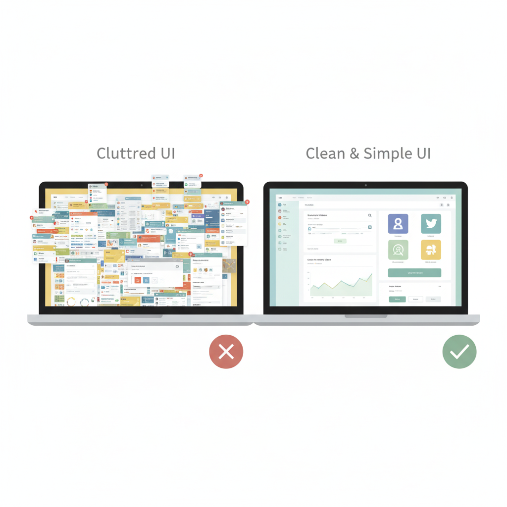
In the world of digital design, there’s one principle that never goes out of style: simplicity. Whether you’re creating a website, a mobile app, or a dashboard, users crave experiences that feel effortless. A simple, clear, and distraction-free interface doesn’t just look good—it converts better and keeps people coming back.
But here’s the catch: simplicity doesn’t mean boring. It means removing the noise, highlighting what matters, and making your design intuitive enough that users don’t have to think twice. In this blog, we’ll explore why simplicity wins in UI/UX, the psychology behind it, and how you can implement it in your designs.

The Psychology of Simplicity
Human brains are wired to avoid complexity. When users see cluttered screens or too many choices, they experience decision fatigue. On the other hand, a simple and clean layout lowers the cognitive load, making interactions smooth and stress-free.
Think about Google’s homepage. Just one search bar, a logo, and two buttons. That’s it. Yet, it’s one of the most powerful products ever created.
Benefits of Simple UI/UX
- Clarity and Focus
Simplicity makes the main goal stand out. Users instantly know what action to take. - Faster Load Times
Minimalist designs with fewer elements load quicker, boosting user retention. - Better Accessibility
Clean layouts with proper spacing and hierarchy are easier for everyone to navigate, including users with disabilities. - Stronger Branding
A simple design makes your brand memorable—people remember how you made them feel, not the flashy details.
Practical Tips for Designing Simple UI/UX
- Stick to 2–3 core colors instead of rainbow palettes.
- Use whitespace generously to give elements room to breathe.
- Limit navigation choices—aim for 5–7 main menu items.
- Prioritize readability with clean fonts like Poppins, Roboto, or Inter.
- Test with real users—if they can’t complete a task in under 3 clicks, simplify further.
Case Studies of Simplicity in Action
- Apple – Their product pages are clean, focused, and visually stunning. Every design choice is intentional.
- Airbnb – Their app uses whitespace, clear CTAs, and intuitive navigation to make booking effortless.
- Dropbox – A once cluttered platform, redesigned into a minimal workspace that highlights only the essentials.
Common Mistakes Designers Make
- Overloading the homepage with text and graphics.
- Using too many icons or animations that distract rather than guide.
- Ignoring mobile-first design, where simplicity is even more critical.
The Future of Simple UI/UX
With the rise of AI-driven personalization and voice interfaces, simplicity will become even more important. Users don’t want extra steps—they want seamless, invisible design that adapts to their needs without friction.
Conclusion
Simplicity in UI/UX isn’t about stripping features—it’s about designing with purpose. Every button, every color, and every word should serve the user’s journey. In a noisy digital world, the cleanest voice is often the one that gets heard.
If you want users to love your product, keep it simple.