Introduction
A website isn’t just a digital brochure anymore—it’s your 24/7 sales machine. But here’s the reality: most websites look pretty but fail to convert visitors into customers. Why? Because they ignore the psychology of user behavior and rely only on design aesthetics.
In this blog, we’ll uncover how smart design combined with psychological triggers can transform any website into a conversion powerhouse.
Why Conversions Matter More Than Traffic
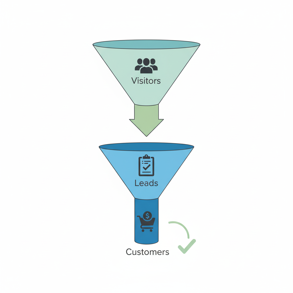
Getting traffic is easy. You can run ads, post on social media, or rank on Google. But if your website doesn’t convert, all that traffic is basically wasted. A conversion could mean:
- A purchase on your eCommerce store
- A lead form submission
- A newsletter signup
- A booked consultation
At the end of the day, the success of your business online is measured not by clicks, but by conversions.
Key Psychological Triggers for Conversions
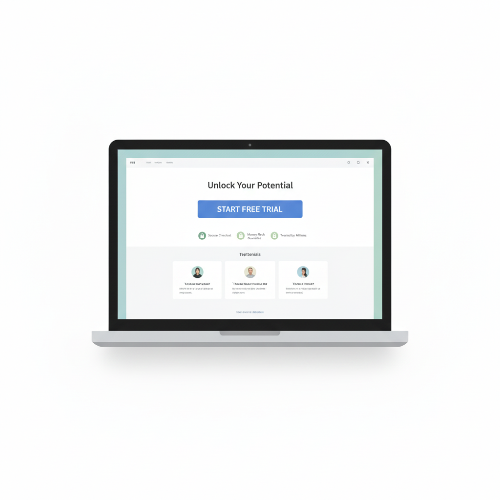
- Clarity Over Creativity
Visitors should understand what you offer within 5 seconds. A strong headline + clear CTA button is non-negotiable. - Social Proof
Testimonials, reviews, case studies, and trust badges reassure users that others have trusted you before. - Urgency & Scarcity
Limited-time offers (“Only 2 left in stock”) push users to act quickly. - Consistency in Branding
Colors, typography, and tone should be consistent. This builds subconscious trust. - FOMO (Fear of Missing Out)
Highlight what users will lose if they don’t take action.
Also Read: Why Simplicity Wins in UI/UX Design
Design Elements That Boost Conversions
- Above-the-fold CTAs – Don’t make users scroll endlessly.
- Whitespace usage – Keeps the focus on what matters.
- Mobile-first approach – Over 60% of traffic is mobile. If your site sucks on phones, you’re losing sales.
- Visual hierarchy – Headlines > Images > Buttons. Guide the eye with purpose.
- Speed optimization – A 1-second delay = 7% loss in conversions.
Case Studies
- Amazon – Masters at urgency and social proof. Every product page is optimized for conversion.
- Shopify landing pages – They balance trust signals (logos, testimonials) with a strong CTA.
- Minimalist SaaS sites – Companies like Notion and Slack keep it clean but persuasive.
Common Mistakes That Kill Conversions
- Overloading the homepage with unnecessary animations.
- Weak CTAs like “Submit” instead of “Get My Free Guide.”
- Ignoring mobile and relying only on desktop design.
- No social proof or trust indicators.
Conversion Boosting Checklist
✅ Clear headline with benefit-driven messaging
✅ Strong and contrasting CTA buttons
✅ Testimonials or reviews
✅ Mobile-friendly design
✅ Fast loading pages
✅ Minimal distractions
The Future of High-Converting Websites
With AI personalization, websites will soon adjust dynamically to each visitor. Imagine a homepage that changes based on whether you’re a returning customer or a first-time visitor. Simplicity + psychology will remain the foundation.
Conclusion
A beautiful website alone won’t bring results. The secret is designing with psychology in mind. When you combine clarity, trust, urgency, and usability, you create a digital experience that not only attracts visitors but turns them into loyal customers.